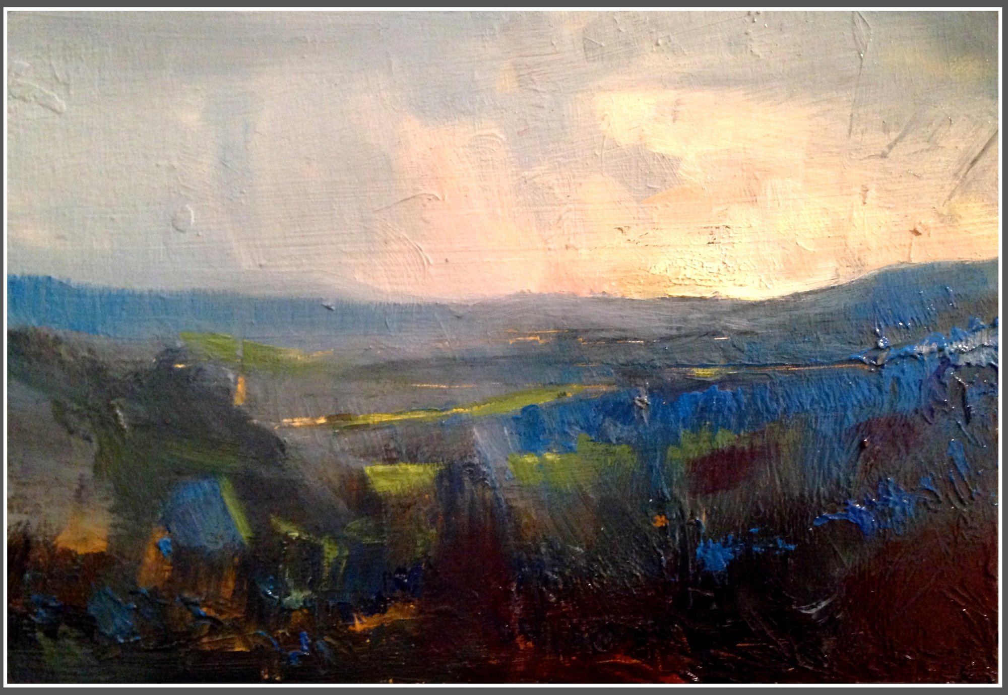
Tutors share their favourite art materials

Art shops are treasure troves of materials—a delight to browse, but sometimes a minefield of choice. Fear not: some of our tutors are here to guide you toward high-quality materials that will help you enjoy the art-making process even more...
View all Living Library content
RDS_RORY_LANGDON-DOWN_SHOREDITCH_SELECTS_B 56
Jake Garfield - Woman-Dressed-As-Frida-In-Front-Of-Frida-Kahlo-Self-Portrait
Jake Garfield 'Woman Dressed As Frida In Front Of Frida Kahlo Self-Portrait', Woodcut, Lino, Stencil, Etching With Aquatint & Chine Collé on 280gsm paper, (2020)

Jake Garfield

Printmaking

I work quite a lot with woodcut, but also bring in elements like paper-stencil, etching and lino for my work. I recommend Shina wood if you are thinking of trying woodcut for the first time. It’s available at art suppliers, is easy to cut into and has a fine grain. If you want to work big then you might want to try birch ply, which you can get from timber merchants. In terms of cutting tools, it all depends on your budget - but the swiss brand Pfeil make very good ones. For inks, I would suggest Caligo safe wash relief inks as they have the texture of oil-based inks but can be cleaned with just water. If you are printing at home, you want to get some thin paper. Awagami make some beautiful Japanese papers and sell a sample pack that you can experiment with to find what works for you.

Fraser Scarfe_pignano_830pm
Fraser Scarfe 'Pignano 8:30pm', oil on board, (2013)

Fraser Scarfe

Landscape painting

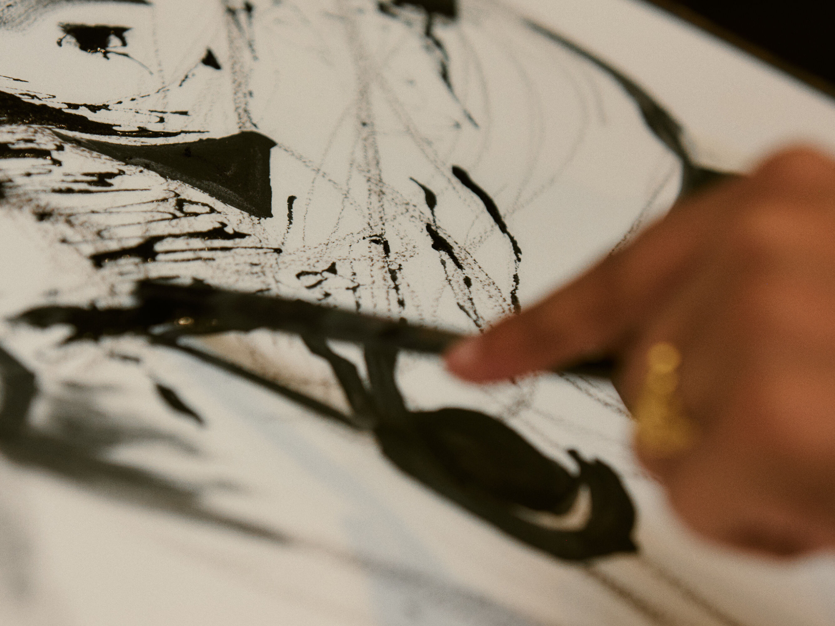
I usually paint directly on location (en plein air) and prefer to use acrylic paint. I use either Atelier Interactive or Golden Open Acrylics, these are designed to dry slower than a traditional acrylic paint, giving me longer to work with and manipulate the colours. Unlike oils though, I still have the advantage of being able to paint quickly and in layers.

It’s tempting, particularly when dealing with the landscape, to try and take lots of colours with you. However, I prefer to work with a limited palette, this saves space and weight and also forces me to consider my colour mixing more. Greens squeezed straight from the tube never look quite right! My limited palette usual consists of: French Ultramarine Blue/ Cadmium Yellow/ Yellow Ochre / Burnt Umber/ Cadmium Red / Crimson Alizarin/ Titanium White / Ivory Black. 

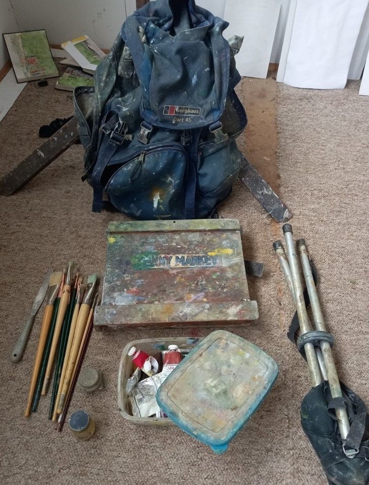
It's important to consider when working directly outdoors how manageable, lightweight and organised your materials are. The logistics of painting on location can be quite tricky; plan what you need well in advance, so you don’t find yourself in the middle of a field without your favourite colour or any brushes. I try to make sure all my equipment fits into one bag or rucksack and doesn’t weigh too much, especially if I need to walk around a lot.

I carry a small wooden pochade box. This contains some small tubes of paint, brushes and a holder for my canvas or board, which is then attached to a camera tripod. I also make sure to have water, rags, canvas or boards and a small bag to take away any rubbish. I’ll always carry a separate sketchbook and posca pens to draw with.

Outdoor_art_materials.width-800.original

Danny Markey

Painting Outdoors

I use a small painting box and plywood boards to work outdoors in oils. This photo shows everything I take with me. I always have an A6 pocket sketchbook on me with 3b or 4b pencils. I also sometimes work in watercolours.

The_King_Who_Banned_the_Dark
Emily Haworth-Booth Pages from 'The King Who Banned the Dark', (2018)

Emily Haworth-Booth

Graphic novel & illustration materials

I'm always a fan of experimenting with different media. In my children's books, which are shorter, I use many more layers of ink, charcoal, colour pencil and watercolour which I create by hand using a light box, then scan in and layer digitally. For my long form graphic novels, I tend to keep it simpler and just use one or two colours, for example a conté pencil and a single colouring pencil, because I don't want to spend hours on each page. Sometimes I just use black ink, water and a big watercolour brush with a fine point – great for multi-purpose work, as you can cover large areas and do fine details with the same tool. For my final artwork I use printer paper or Bristol Board depending on whether I'm using dry or wet media.

My favourite sketchbooks are Moleskines – the ones with the fairly thick, creamy, smooth paper. They work really well for "research drawing" out and about - you can use them with refillable Pentel Aquash pens (although never use those with Indian Ink as it clogs – FW Acrylic Ink works well) and the paper and ink work beautifully together.  

I tend to plan my graphic novel sequences outside of a sketchbook as I like to be able to spread all the pages out on a big table and see how they work together. For roughs I love a combination of 'Blackwing' pencil and a 'GraphGear 1000 Pentel' refillable mechanical pencil, with 0.7mm, 2B leads. They are just sharp enough for doing small details like eye dots and readable lettering, but soft enough to give some expression and feel good moving across the page! For paper, I tend to use plain recycled printer or scrap paper for roughs, along with Blu Tack for sticking panels down and moving them around again when editing - glue is much too final!

Bringing-it-all-together-SQ
Sam Marshall 'Bringing it all together', linocut

Sam Marshall

Linocut

For Linocut printmaking, I prefer Japanese Vinyl to the traditional grey lino as you can use both sides and I like the detail you can achieve. I always use Swiss Pfeil tools for carving and Caligo safe wash relief inks - I love them as they are oil based but water soluble. For carving tools I would suggest buying the best you can afford as the cheaper ones will frustrate you and might just put you off! With paper I wouldn't worry too much when starting off. As you will be printing by hand at home, any paper that is lightweight and smooth will do the job.

RDS_RORY_LANGDON-DOWN_SHOREDITCH_SELECTS_A 35-2

Stephanie Forrest

Ink

Liquid Indian Ink is not waterproof which means it can be modified and lifted with a clean wet brush and kitchen towel. It tends to dry to a paler, grey-black. Liquid Indian Ink is closest to the ancient Chinese recipe used for calligraphy and painting. If using Windsor & Newton inks, it’s the one with the dragon motif. 

Black Indian Ink is waterproof. Being resistant to water, it can’t be lifted once dry. This makes it ideal for layering marks and washes. It’s made with a shellac binder so it dries with a sheen to a denser, more powerful black. I recommend Windsor & Newton (the one with the spider motif) for when you need them to be water-resistant. 

Sennelier’s Drawing Ink is a beautiful range of luminous colours with good light resistance. Rohrer & Klingner’s ‘Antique Ink’ is a great range of very natural, traditional colours. They have an acrylic resin base, with a high pigment content. They can be lifted when still damp to leave interesting stains and edges. Liquid watercolours or concentrated inks such as the Dr Ph Martin’s range date back to the 1930s; the colours are very vivid but not lightfast, meaning they’ll fade with time if exposed to light. UV filter sprays will protect them and extend their lifespan. Gansai watercolours are expensive but excellent quality, highly pigmented watercolours in pans.

In terms of paper, one of the very best watercolour paper brands is Saunders Waterford which you can buy in sheets with deckled edges. Stonehenge Aqua Watercolour paper, Fabriano and Arches are also lovely.